It’s scary to realize I was making art for Flying Buffalo and Tunnels & Trolls 33 years ago. More than that, actually, but for purposes of this post, that’s the relevant timeframe.
 In 1978 or so, a college student named Michael Stackpole had been playing Tunnels & Trolls long enough to try his hand writing a solitaire adventure for the game. What resulted was bigger, it had more of a story, and was generally better than what had come before and “City of Terrors” was swiftly accepted for publication by Flying Buffalo. We had other things on our plate to finish up before getting to it, though, so the manuscript sat around for a little while.
O CANADA
I was already working for Flying Buffalo when CoT arrived, the staff artist and answerer of telephones. Back in those days, most of the company would pile into a van to drive across the country to attend conventions. With most of the rest of the crew, I attended a new little games convention early that year: CanGames in Ottawa. Mike lived more or less across the border in Vermont, and made the trip to the convention where Ken St Andre (T&T’s designer) and Ugly John Carver (“Uncle Ugly’s Underground”) and I met him for the first time. We all got along very well and the convention was a blast.
(Before you ask “Hey Danforth, where is this rambling narrative going?” I’ll ask you to bear with me. I’m telling you the story of the cover art of City of Terrors.)
THE AMBER GAME
Some months previously, the ever-inventive Ken had decided to try to cook up a game based on Roger Zelazny’s Amber books. The original novels (the ones about Corwin that started with Nine Princes in Amber) were not yet all released — Courts of Chaos would come out later that year — but we were all reading them feverishly, and Ken was in correspondence with Roger. I had started a nine-panel painting of the Trumps*, and had asked Zelazny if I could get a photo of him to work into the face model for Corwin. (Never mind there was the guard named Roger hanging out in the basement, in the canon.)
 Ken’s friends and correspondents were invited to pick a favorite character directly or obliquely derived from the books. Ken assigned various goals (most of the princes were expected to try for the throne, for example), and we found ourselves in what was, in essence, a LARP (live action role playing game) before the term was ever invented. We schemed and connived and plotted, playing things out face to face or through letters, as many players lived in other parts of the country. The sheer volume of correspondence was phenomenal. What events were publicly known were written up and shared in a fanzine-newsletter called Hellride, edited by Ken.
We already knew Mike as Brand, or occasionally as Brandon Corey. He knew me best as a profuse correspondent named Random. Ug occasionally went by the name of Fiona. (Put that eyebrow back down. We were old-school role-players and gender bending was simply not an issue.) The game eventually ground to a halt a year and a half later, but it was still very shiny and new when we all met. (Just for the record: this was several years before Erick Wujick’s Diceless Amber Role Playing Game came along.)
MAKING CoT
Fast forward a few months. Mike had visited the Flying Buffalo offices in Arizona, everyone got along smashingly, and he would eventually move out to work for the company after graduating from the university. Meanwhile, we wanted to get City of Terrors properly illustrated and produced. We all knew the solo was pretty special, so we pulled out all the stops. Rob Carver (Ugly John’s brother) and I vied to make as many of the best illustrations we could, and endlessly tried to top each other while still being privately awed at the oh-so-cool artwork created by the other person. (At least, that’s how it was for me!) In short, we took it completely over the top.
When it came time to do the cover, though, we were stumped. There were no color covers for solos back then, but which of us would do the art? We both wanted to. In the end, we decided to collaborate: each of us would draw some of it, ink some of it. We’d make it a full wrap-around cover and go to town (more or less literally).
So that’s what we did. This was the result.
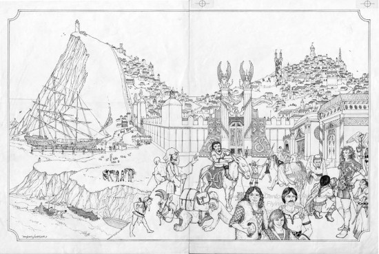
It was, without question, the most elaborate thing I’d done to date. (The original is 21″ x 14″.) Rob always had more fiddly bits in his art than I did, but that meant he put in every darn house on that hill, drawn in detail, and every leaf on the mage tower in the middle of the town. People used to laugh at me for using the hair-fine 6×0 Rapidograph nibs, but even they seemed too big and clumsy for the work to be done on that drawing. I’m proud of that piece but DAMN it was a lot of work!
HERE IS THE FUN STUFF
Amber pretty much colored everything in those days, for those of us playing, and the art in CoT is no exception. I was the littlest princeling, playing Random, who seemingly had no chance whatsoever to achieve the throne of Amber, despite that being one of my win conditions for the game. (I was highly amused when my namesake did, in the end, achieve it in the books!) Mike’s character, Brand, had not yet been revealed as perfidious. Rob had scored the enviable role of Corwin himself.
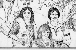 So we put ourselves into the illustrations when occasion allowed for it.
Most blatantly, there were the three characters front and center on the cover, the creative folks most responsible for the book. Mike/Brand, casually tossing the Jewel of Judgment he was supposed to acquire in-game. Rob with several iterations of Corwin’s iconic rose. And me, sporting what looks like sliced oranges for a vest design but which is a tessellation of the Wheel of Fortune, the Tarot-card equivalent firmly associated with any character going by the name of Random. (Another drawing of this character appears with the Wheel on his chest in a more obvious manner.)
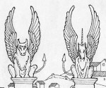 We also made more oblique references to Amberesque inspirations. Notably, the sign of the unicorn shared equal prominence with the winged buffalo above the city gates!
It seemed so justifiable. After all, if all worlds were a Shadow of Amber, the City of Terrors was simply one of the more weirdly warped and far distant echoes.
I should note for the record that Mike had no such intentions when he wrote the solitaire — it simply became a gigantic running in-joke amongst all the creative minds involved, once the illustrations began to be drawn.
Our first job, while illustrating the book, was to adhere to Mike’s words and bring them alive. I think we did that, in spades. We took liberties with everything else, working jests and commentary into many of the pictures. I recall the thief Marek (a character Mike wrote in some of his early fiction efforts) was depicted with the same clothes and face as “Brand”, which was in turn based on a school photo Mike had mailed for me to make a “portrait” that was published in Hellride. I made portraits of several characters for the Amber game, and it was really interesting to morph the face of a handsome, straight man like Ugly John (who got his name the same way bald men get called “Curly”) into an attractive woman for the portrait of Fiona.
IT CAN BE YOURS
I promised not to make every story-about-the-pictures post about something for you to buy, but this one does have that aspect. Yesterday I posted the original art for the City of Terrors cover to eBay with a minimum bid of $350. The auction will run to 25 Mar 2011, until a little after noon PDT. All the details of the sale are there, so I won’t repeat them here.
 I would love to see this piece go to a good home. There are not many pieces of art from that time, and virtually none from the interior of City of Terrors.
Why? We were young and foolish, albeit with good intentions. In order to get a sharp, clear image from the art, we didn’t want to paste up photocopies — they were relatively fuzzy and poor quality back then. We either didn’t know, or couldn’t afford to get PMTs … photo media transfers … of the artwork. Only giant print shops had scanners, and tabletop publishing was still many years in the future.
So we pasted up the originals. With rubber cement.
For those of you who don’t know, rubber cement is a slow but virulent chemical fire. Even after a few years, paper slathered with rubber cement turns brown; in a few more years it turns as black as any paper thrown into a fire. Such was the fate of nearly all that art, making this cover something of a rarity. Coming from the early days of fantasy role playing games, the piece should find the chance to live with someone who will appreciate it, instead of collecting dust on my shelves.
*AS A FINAL ASIDE
That nine-panel painting of the Trumps, which I mentioned up above? It no longer exists, so don’t bother asking. For one, I only got about six of the portraits completed. For two, it had the misfortune to find itself under a leaky roof some years later. Since I was painting on illustration board at the time, there was no saving it, although I think I set aside a couple of the portraits (cut out of the whole) that weren’t too badly damaged. However, I haven’t seen them in years. If I do ever unearth them, I’ll certainly show them here! They too have a long and storied history.
Thanks for sharing that bit of history of the cover art, a very interesting and enjoyable read.
Well from one City to another thank you Ms. Danforth for a facinating insight into the creation of what is probably the bext of all the solitaire books published by any company.
Amber is a great series – I could see why you where all so caught up in it.
it’s a great cover piece – i hope it does find a good home!
It is a fantastic piece – had I the $, I’d give it as good a home as I could…
Hi Liz,
Thank you for sharing these memories. I still have my original copy of City of Terrors. I have fond memories of playing the solo.
Thanks for sharing the memories on this piece of art. A nice trip down someone else’s memory lane. Love the feeling of nostalgia this gave me!
Oh if only I had the money.
I too hope that it goes to a great loving home.
Thank you for the story. It was a great ‘trip’. 🙂
Thanks for the nice comments, everyone.
The piece was purchased by a private collector on eBay for $800. My pretty lengthy correspondence with this individual assures me that it is, in fact, going to a very good home — and I’m happy.
Am glad it went to a good home. And I do regret that it’s not the cover which is part of the current PDF. (sigh)
*jeep! & God Bless!
–Grandpa Tzhett
Oops! My error! I see it’s on the FBI site, but not as a PDF. I remember (now) that I didn’t order it because it has a different cover. (Somehow, I misremembered ordering it as a download — about three or four years ago.)
I believe that much of Flying Buffalo’s material is available on RPGDriveThru. I will encourage you to purchase there, or directly from FBInc, because there is at least one site online offering T&T material (sometimes for free) but which has no license and no permission to distribute, and which does not support the creative minds who brought you the words and art you enjoy! That is simply caveat emptor and information provided for purposes of education. 😉
But thank you for the kind words!
Sitting in my stuffy UK office on a slow Friday afternoon, I had a sudden, random urge to see again the cover of that solo T&T adventure I used to love poring over in my youth. It always seemed so exotic – much more so than the mundane AD&D artwork that was around then. I Googled ‘City of Terrors’ and found myself here. Thanks for the story, Liz, and thanks so much for the wonderful art that made my world a more interesting place when I was growing up.
Tony, thank you! I’m really glad to hear when people tell me such work as I did, loving doing it, made some difference to them. Thank you!