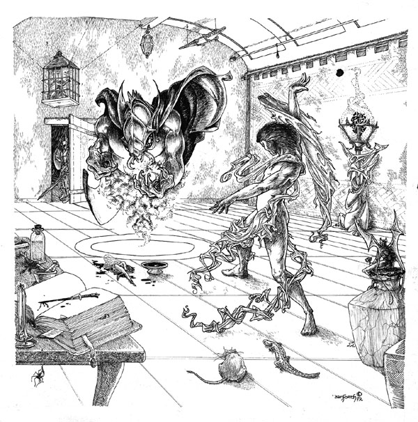
SOME PICTURES ASK you to delve into them, to explore all the bits of imagery included in the scene. The piece I call “The Summoner” is like that. I wanted to give the viewer so many little bits to think about that they would spend more that that oh-so-brief moment an artist usually gets from people looking at her work. I wanted to seduce you into the picture and give you things to discover if you spent more than a moment looking at it.
It isn’t quite the piece I wanted to do, but it is nevertheless a piece I’m proud to have done. More after the jump.

GENESIS
This piece of art was originally done for the Tunnels & Trolls Fifth Edition rules, and was (as I recall) one of the last pieces to be drawn. I’d done the lengthy rewriting and editing, and the intrepid Pat Mueller was transforming everything into a finished book. She and I laid out pages, and if there was a nice blank spot, I did something to fill that space referring to the topic being discussed there. Which makes the inside back cover art a little different — it wasn’t there to illustrate anything in particular.
I wanted it to give the feel of how delvers explored in those days. In its worst form, it was “room-monster-treasure.” In this case, I wanted to turbo-charge the players’ imaginations a little. Yes, here’s the room (complete with a grid on the floor, hearkening to the old school graph paper we used!) and a monster — although whether the magician or the demon being summoned was the more monstrous of the two is for the viewer to decide — but there is more.
A dagger dripping with the fresh blood of the slaughtered fairy, a newt and a rat and an imp quaffing the Light knows what from the goblet in its hand … a Merlin’s-workshop alligator up at the ceiling … a wall-spanning tapestry (what’s behind it?). A spider. A bit of bone like a stir-stick in the mortar on the table. Notes sticking out from a grimoire full of … what horrific spells? A lamp(?) with something arcane for its “fire” or is that a censer? Do you want to breathe what it is exuding, if it is the latter? And there, at the door: the first of the party of delvers about to enter this necromancer’s domain, while overhead, unseen, something caged waits and watches.
If there is not something in there to launch your imagination into more than a few possible scenarios, I can’t imagine what might.
 NOT AS I WANTED IT
I actually wanted to make the piece feel tight and close and claustrophobic. The room is big, apparently well-lit — but then, what dungeon rooms were not, back then? Either you were in pitch darkness or, once you lit a torch or a Will o’ the Wisp spell, all became clear as daylight. I would do a very different piece today, even if I used the same scene. (Which, as I write this, seems like it would be a helluva lot of fun to try!)
As I was doing the work, I knew it was going to turn out to be something pretty special. I recall being short on sleep, working crazy hours, because we were on a deathmarch to get the book finished in time for … something. Probably the summer conventions, first Origins and then GenCon. I have a vivid recollection of being deep inside the paper — not literally, but mentally “in the flow.”
Then co-worker Mike Stackpole walked up behind me, startling me out of the paper, breaking me out of “the zone”… and I flinched. Hard. My arm hit the side of the drafting table where I was working, and the pen splashed ink across the work I’d spent hours on.
I was in tears. Mike was apologetic but it was up to me to decide whether to trash it and start over, or try to finish it anyway.
I couldn’t bear to start over.
In an effort to keep my originals pristine, I would typically haved just scraped off a misplaced bit of ink rather than use White-Out. For “The Summoner” piece, that wasn’t an option. Ink was everywhere. So I got out the White-Out, and finished the piece as you see it today.
MAKING THE PITCH
For some art collectors, something like White-Out is a deal-killer. I hope it is not a deal-killer for everyone, though. This is a pretty special piece, even if it was damaged in the making. Like the City of Terrors cover I talked about last March, it comes from a time when few originals survived, although I did a prodigious amount of artwork. This piece doesn’t have as deep a story as the CoT cover, but I still look at it and remember every line, every overly-elaborate fold of cloth*, and the smell of the very old drafting table I worked on in the Buffalo offices.
I am offering this original on eBay right now, under the description “Tunnels & Trolls ORIGINAL ART “The Summoner” Danforth 5th edition T&T RPG rules” in the Category “ Toys & Hobbies > Games > Role Playing Games > Fantasy.” It is up with no reserve, minimum bid of $200 and a direct-sale price of $1000. Bidding will close the evening of October 4th. I hope it finds a happy home — that’s all I’ve ever wanted for any of my original art.
*A FINAL ASIDE
Yes, this piece does qualify as one of those where “…the men in her art show a hell of a lot more skin than the women.” I believe it was this Ed Heil who made that observation in a forum post I ran across last year, and I’ve been bemused to realize how often he is correct, ever since. While the Tumblog about “women fighters in reasonable armor” has been tearing up the net for weeks (and I highly approve!), I’ve been dressing my women up and my men down for … decades. Guess it’s all in what you enjoy looking at.
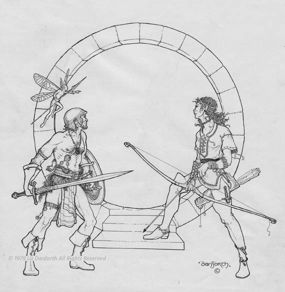
And here’s another example of an underdressed male (and another piece going to eBay soon!). Yes, it’s the framework into which a separate drawing of the cavern was emplaced for the black-and-gold box set of T&T. But that’s a story for another day!

Thanks for telling the stories, Liz. I hope you get a great sale out of it. I’d buy it, but I have about as much money as you do.
I have always loved the alligator in particular.
Didn’t you use the same spellcaster on the ‘Never Refuse’ art for the White Hand expansion of I.C.E.’s Middle Earth: The Wizards collectible card game?
I know when I saw ‘The Summoner’ posted on your blog in the entry several weeks ago, one of the first things I thought was to the effect of ‘hang on, I’ve seen someone like this in an action-spellcasting pose somewhere before…’
Charles, not “the same” because I don’t make a habit of revisiting old works… but the same feel, the same not-quite-nakedness, the same sense of deliberate evil: yes, “Never Refuse” has the same echo of this scene. The emotional content is intentionally there to make it clear who the bad guys in the scene are. 🙂
Liz, for another shout out to this image, check out the essay “Naked Went the Gamer” by Ron Edwards — it’s about (best I can sum it up) the “sanitizing” or “Disneyfication” process the RPG industry as a whole went through in the 1980s in an attempt to make everything harmless and squeaky clean for the mass market… and how the disappearance of actual nudity in RPG art (to be replaced by the ridiculous “fur bikinis” of Dragonlance) reflected that process.
http://adept-press.com/ideas-and-discourse/other-essays/naked-went-the-gamer/
I’d be curious what your take was on that!
Having read the post, I disagree on many counts and agree on a few. A tiny comment box isn’t the place for a full-blown discussion. However, I’m already making notes on a new blogpost because of an email I received this morning about the topic raised in this post, regarding the clothing of fantasy figures. I’d been considering talking about it after reading a blog some weeks ago anyway… perhaps now is the time.
Oh, and as the original Melee artist, I can tell you I know I did not have cock and balls hanging out from the gargoyle on the cover, no matter what he imagines.
Cool — it’ll be interesting to hear your reactions. I didn’t know you’d done a cover for Melee — it looks like there were at least three versions of the cover, and he’s not talking about the one you did (which I assume is the one on the left, in the group of three on this page):
http://apaladinincitadel.blogspot.com/2011/02/fantasy-trip-too-much-of-good-thing.html
Wow, that’s a pretty sweet drawing. I didn’t even know about that. Here’s a better image of it:
http://tomeoftreasures.com/forum/viewtopic.php?t=931&start=0&postdays=0&postorder=asc&highlight=&sid=3896b7dcc9d7d22fb49b1531301fc537
From the Paladin blogger, http://apaladinincitadel.blogspot.com/2011/03/wizard-microgame-micro-art.html and http://apaladinincitadel.blogspot.com/2011/03/melee-microgame-counters-bell-bottoms.html … which actually will factor into my reaction to Edwards’ essay.
I have such fond memories of this Piece,It sweeps me back to the City of Gull, the arena of Khazan and Mistywood. Its the type of artwork that sparks the imagination and stills holds up very well even today.
I have always felt like I was the adventurer coming thru the door and discoving the conjurer within the room….
What a great picture !
I was hoping you would revisit some of your art and give us a sequel….. like picture number 2 and 3 of the story…
especially for the art from City of Terrors…
I recall a picture I think you did with a lone adventurer going up some steps in an abandoned city.. Long straight sword was his hand and he was looking back over his shoulder like he had heard a sound … but he was looking out of the page like it was me who made the sound and got his attention…
Additionally I LOVE the fashionable clothes your adventurers wear…
I have bought over twenty of those Tunnels and Trolls Solo adventures and Your art was sooo spectacular….
I hope to someday see ALL of the art you made for Tunnels and Trolls So I am hoping you continue posting Them and commenting on them…
Thank you, John! I wonder what the picture is you describe — nothing I can think of comes immediately to mind. 🙁
I think the “Pictures Have Stories” series are well-received. As I have stories to tell, I think I’ll continue to post about them!
wow…. here I was surfing for ‘gnomish’ info after Second Life kicked me offline (I was visiting a fantasy RP zone) and suddenly remembered Tunnels & Trolls — which led me here. I LOVED the drawings you did for T&T… it was what got me ‘hooked’ on fantasy gaming… even if I did kind of ‘defect’ over to D&D and later AD&D. I tried to emulate your work over the years (unsuccessfully) but.. STILL think it is some fun ‘candy’ for the eye.
Koldrake, thank you for your kind words… and for bringing this post back to my attention. As I’ll note in today’s blog entry, you have sparked my own imagination (as I hope I’ve sparked those who saw this picture originally) and although I’m in the middle of other artwork, I’m going to the sketchbook today…
Liz, your art introduced me to a lifelong hobby that has kept my imagination alive and sparking since the early 80s. Thank you so much. I cried when I just found out you sold these iconic RPG pieces on eBay – and I missed them…sob. So looking forward to the new deluxe game. I am a special education teacher and am in the process of introducing T&T to my pupils. They will love it, and your visuals will help blow them away as they did me a few decades ago. Please keep it coming. x
Oh Matt, you are wonderful to say this! We are hard at work today (and even yesterday, on Christmas!) working to make the Deluxe edition come to be. Thank you for the encouragement!
As for this piece of artwork: I’ll let you in on a secret… one of the pictures I want to do in the new edition will refer back to this one. In an interesting, cool way, I think! But we have a lot of hoops to jump through first.
Just ran across this. This is definitely one of my favorite pieces. Love this one and I love hearing the story behind it!
Thank you, Rob! We’ll see if I have time to revisit this concept for the new edition, eh? Don’t hold your breath… I have a lot of work (art and editing and writing) that I need to do before even thinking about this … but it IS something I’ve been thinking about doing. Deadlines will probably dictate whether it happens or not. 🙂
Oh wow, this piece had such an impact on me as a middle school age gamer. The composition is fantastic, the grotesqueness of the demon, the pathos of the dead fairy, the otherworldliness of the magic user. Not to mention all the other little details which leave you wondering about the story.
As for the scanty clothing, that you also referenced in your post on the Monsters! Monsters! cover, it needs no defence. It just looks wonderful, references baroque and renaissance art, and implies a rich fantasy world with its own culture and mores, not just a gamer’s mentality of “would this be practical or not”.
Wow, thanks! It’s such a kick for me, that people are still looking back at the older posts like this one… and reminding me of the new piece I want to do for the deluxe edition! With so much that’s gone on, it had slipped my mind. *makes-a-note*