 I PROMISED TO post up another piece of old art for sale when I wrote about “The Summoner” last week. I thought I would get it up in a day or two, but it took a little longer.
If it’s true that, as I said, some pictures “ask you to delve into them,” then this is one of those. Still, you must prod your imagination for this one.
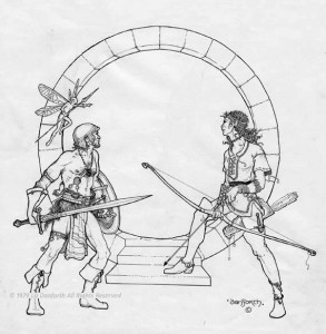
Today’s piece — I call it “Into the Tunnels” — offers few of the hooks present in “The Summoner.” Here, the mystery is just an opening, a portal, a moongate. The characters are poised, weapons drawn and ready, and the fairy is pointing at… something.
But exactly what’s beyond? That’s for you to decide.
INTO THE TUNNELS
This artwork, available now on eBay as promised, does not have the storied history of some other works I’ve offered. It was published on the cover of the first boxed set, the hard-to-find black and gold box. As published, the delvers DO have somewhere to look forward to exploring — they are looking into a stalactite-laden cavern. Lying out there in the open, unattended, is a glowy mound of treasure. Not a monster in sight but … surely they know it won’t be that easy.
That cavern was drawn as a separate piece of artwork, then fitted into the opening. I was so pleased with the main drawing of the delvers, I was scared to death to “ruin” it trying to make an image within. In 1979, which (as near as I can tell) is when this piece was done, I had a lot of confidence in my ability but it wasn’t at the point where I could be sure I could pull off everything I could imagine.

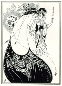
My work has always been very graphical, very designy — a reflection of the Art Nouveau-style of book illustration I learned to ink from. Aubrey Beardsley, Alphonse Mucha were effectively my mentors. Complex, multi-dimensional images posed a challenge for me.
In this case, I admit it — I blinked. By doing the other piece separately, if it didn’t work, I hadn’t ruined this original. I have to say that more complex scene never really did a lot for me. The cavern wasn’t “right” for the rest of the picture. “Into the Tunnels” might lack a certain something, the expectation that something more should be going on inside that gate, but I still like it just the way it is.
BLACK AND GOLD
The box the art went on was widely lauded as having real visual impact. Slick, shiny black paper with gold ink. In the days when RPG book covers were a riot of often garish color — the beautiful work of Parkinson, Elmore, and others was just beginning to be seen — the black and gold of the T&T box was very different from the rest of what was on the shelves. That was the point: simple, sharp, refined, and elegant. Classy.
It was also a one-color print job that the company could afford better than full four-color reproduction! WIN! As I recall, it was Ugly John Carver who came up with the idea, but we were all inordinately pleased with ourselves — and evidently the fans liked the box as well.
So if “The Summoner” original isn’t a piece to suit you (it is still available to be bid upon as I write this), perhaps you would like “Into the Tunnels” instead. It comes from the same time period, and if the stories that it comes with aren’t as elaborate, perhaps the moongate opens the doorway for your own stories to be told about where these three adventurers might be going.
After all, T&T always was about the stories you could make.
Isn’t it the philosophy of the Stargate? ‘Portal supplied; dial up the adventure required.’
😉
This was done long before Stargate but well after “City on the Edge of Forever.” I’d say that’s probably more its antecedent, aside from my love of that style of circle-behind-the-scene design element (which is very Mucha).
I think the first time I came across a picture like that with a circle in the background was a cover of Alan Garner’s ‘The Weirdstone of Brisingamen’, which I think was from the eighties (although could have been earlier). I searched around the web for images, but the only ones I’ve been able to find aren’t terribly clear on detail. This is the best I’ve been able to find so far, and I’m afraid I don’t know who drew this version of the cover:
http://www.plokta.com/deliciouslibrary/images/156CEC3D-7834-498E-B54C-FDF9D2FE8AE5-256.png
You should explore Mucha’s work, which was EVERYWHERE when I was younger (in the 70s), and his design style influenced many.
This is another poster that hung on my wall for years: http://bit.ly/qeJgFU and many of his works evidence the circular or “Q” framing.
Although whilst looking for information, I was surprised how many different covers of the Weirdstone there have been. Multiple generations across several countries have each had their own cover for the book it seems…
We didn’t really do art at school, so besides the odd book-cover the art I grew up with were on the stamps I collected for a time such as the french 1946 Roc-Amadour stamp: http://images5.images5.images8.stamps-gallery.com/Rocamadour-stamp-10167834
and the french 1953 literary figures and national industries stamps such as:
http://images5.images5.images8.stamps-gallery.com/Gargantua-stamp-10167717
and
http://images5.images5.images8.stamps-gallery.com/Mannequin-stamp-10167718
It was fantastic the detail that the artists of an earlier age could get into something so small and yet which could be reproduced…
Later on I discovered Alfred Wainwright who produced a series of pictorial guides to the English Lake District, and who produced incredible line drawings…
I’ve done a quick Google images for Mucha, and I’m not quite sure what to make of him. The internet being the internet, I can’t be sure if what Google images shows is an at all fair representation of what he’s done.
Some of ito does remind me a bit of a couple of Royal Doulton figurines though:
http://t3.gstatic.com/images?q=tbn:ANd9GcQwmjFQkXovs1lMVLHrxr3NwJ_ezGGUUONIe5lXUTvosq9wbTLi
and
http://t3.gstatic.com/images?q=tbn:ANd9GcSUQ8T9CERZTHgfZZlPMatnoothvgIucY2Exv7yNFtbUSdZ4w5o8Q
Hello
I thought I would post here in the section “Pictures have stories” and ask about My favorite cover art for a role playing game….
You drew the cover art for the Role Playing Game Monsters Monsters….
I have always loved that particular cover and i think it is for many reasons…
The Monster riding a monster that is grasping the warriors shield… The warrior is wielding a Morning Star !!! And the Dark haired woman is moving into attack….
I can nearly hear the screech of the Beaked monster..!
I was hoping you might say a few words about the cover…?
I did see another Monsters Monsters cover with a continuation of the same scene where The warriors shield has been ripped off his arm. The Monster riding a Monster Is rearing up and the woman has turned toward the Monster Monsters Swinging her sword….
And Then…
And Then…
I have been waiting a long time to learn their fate….
I was hoping you might have more of them …