SO MUCH FOR my resolution to write every week or ten days.
Alas, blogging is only a piece of what I do, and I believe in writing posts that have a bit of meat to them. I could throw you a bone every few days but since I seem constitutionally incapable of writing a “short†post, even a brief effort will eat up most of my workday. Today I’ll serve up a smorgasbord of news to nibble on.
(And yes, you correctly guessed that I haven’t had breakfast yet!)
BUFFALO CASTLE
Ken St Andre commented on the previous update, telling me I ought to tell you all how the auction turned out. All in due time!
The four slots I offered were taken, and in fact I will be doing six portraits in all. I’m already underway and having a blast with it.

TRAVELLER
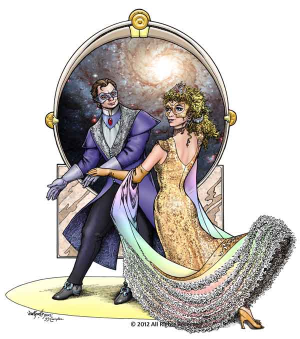
I get asked for a lot of fantasy art, but most of January’s work was science fictional. For several months now, I’ve been working on Marc Miller’s new edition of Traveller and I did a dozen new pieces for him last month. They ranged from small spot illos of various robotic brains to a full page, full-color plate that Steve Crompton and I collaborated on. The picture below is the centerpiece of a poster advertising an insert-a-chip-in-your-brain full-immersion “experience†where, like Cinderella, you wrap up the night’s festivities with a head-spinning final dance with the Prince himself. Roll-check your SAN!

The inkwork is mine, and then Steve and I spent a few days knocking emails back and forth to develop color schemes and how to light the scene. Steve did the color work based on our discussions, and he came up with the lush textures of the woman’s dress, which were then echoed in other elements of the picture.
Steve said this may be one of the best colorizing jobs he’s ever done, and I am entirely pleased and proud to have his signature beside mine on this piece. Both of us are hoping more of our clients will be interested in this kind of collaborative work from us. It just blows me away to see what he can do with my simple line art. The man is an amazing talent.
ROBOTS
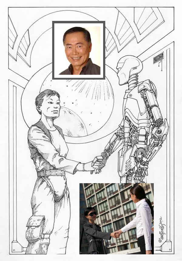
James Maliszewski also had me doing a bit of Traveller-related artwork, scheduled to appear as the chapter-opener in a book called Thousand Suns: Technology. The chapter is all about robots and playing them as characters. James says the book will probably come out in April or May.
I was really happy with how the picture came out, and James posted a few words about the picture in his Grognardia blog because he was pleased with it too.
The comments to his post left me bemused, though. George Takei? Droopy breasts? I succumbed to responding there (which, really, I ought to know better, but sometimes it’s hard to fight the black hole gravity well of OMG someone is wrong on the Internet). What I didn’t say there but will say here is “Oh? Do you really think all Asians look the same?â€
More charitably, you could argue that Hollywood still offers us a very white landscape of faces in science fiction, so any Asian in a space setting is going to evoke a mental jump to George, but still…really, guys? Really?”

James’ art direction for the piece was clear: “a single human being, preferably a woman, shaking hands with an anthropomorphic robot… I don’t want him/her to look like a supermodel or an action hero … I also like the people in any art to be of varied and/or indeterminate ethnicities.â€
And just to be perfectly clear, the other inset picture is the actual reference photo I used, from Thinkstock. Posing two figures shaking hands is more problematic than it seems at first blush, if you want them both to be fully depicted. Funny how the women are Asian but don’t look a thing like George Takei. Must be the sunglasses.
MORE NEW WORK
When I finish this post, I will load up an extended assortment of my recent work into the Newer Artworks page, and move some of the earlier pieces into the regular gallery.
And while the majority of my time is going into my assignments right now, I also have a sketch started that may grow into a painting I’ve been noodling about with for rather a long time. I rarely get to do work “just for myself” but I’m trying to give it my Google 20% time, which doesn’t get nearly 20% of my attention these days. I haven’t been writing much fiction since my laptop died — a conceptual problem that irritates the hell out of me, because that work shouldn’t be dependent on what machine I’m working on — but I am still trying to use the time (when I get it) for other things that sharpen the saw, that restore my creative spark, that ensure I never get bored doing what I do.
If the sketch grows into more than a glint in my eye and some chicken scratches on paper, I’ll tell you more about it!
It was my honor to be able to color some of Liz’s work. The first time it happened was almost by accident. I was working on a deck of cards and one of the cards included an illustration by Liz. Since all the other cards were in color, I thought it would match better if the piece were colored, so I offered to do it. Needless to say, Liz was hesitant, but agreed to let me try. She was very happy with the results and we’ve looked tfor opptunites to team up again! : )
The Traveller piece is wonderful! (Also good to hear that Miller’s work is continuing on the new edition.)
I’m so glad I discovered this blog; I have always been a big fan of your art. Seeing new work from you is a total joy!
The lady with the bot sure looks like she could be George Takei’s sister. (Or a younger George in Drag.) It’s a really startling resemblance, intentional or not. Not to current George look, but to George as he looked while on the set of Black Sheep Squadron… see photo at: http://sharetv.org/images/black_sheep_squadron/maj_kato-char.jpg
I’d still say the resemblance is more in the eye of the beholder than in the ink on the paper. If anything the Black Sheep photo (dang that’s small!) looks even less like the woman here.
Oh, clearly that’s Sulu shaking hands with C-3P0. I don’t know how anyone could see anything else in that picture.
Actually Liz, what strikes me is that the handshake you’ve drawn looks a lot more natural than the photo. They’ve got their arms held out so far it just looks wrong – like they’re pulling on each other or something.
Just remember this:
1) George Takei is beautiful (I can’t deny it. The man is awesome).
2) Beauty is in the eye of the beer-holder.
3) Ergo, people seeing George in this drawing are drunk!