I PLANNED TO close the auction of my two paintings a few days ago, but have been persuaded to keep it live a little longer. There was something about “Buy this painting or we’ll kill a bunny.” I’m not sure that “bunny” was actually the word there — the writing on the note was terrible.
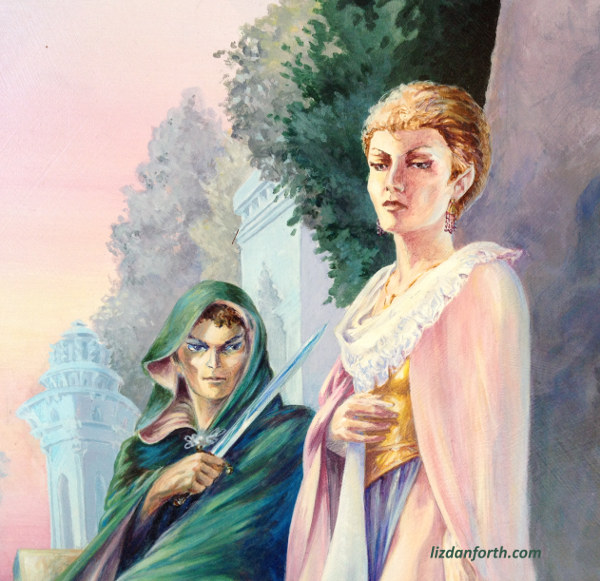
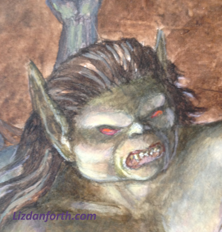
I chatted about the two paintings in a pair of posts just previous to this one: the Elven Lords painting and Two Seconds Later, the cover art I did for one of T&T’s previous editions. And then I put them up for sale to the highest bidder.
Both paintings have been bid on. Elven Lords has a bid of $1000 and Two Seconds Later has a bid-to-beat of $511.
I admit that I thought each painting would have been competed for a little harder. I liked the first so much that I hung it in my room for many years, not intending to sell it at all. However, from years of selling art at conventions, I learned to make my minimum price something I would be okay with if no one else bid against them. If no one else bids, the current supporters will get these paintings.
I’m okay with that. Are you?
That’s okay; maybe you are. But I don’t offer my larger paintings for sale often. I rarely attend conventions of late, which is where my art was most readily available. If you’ve ever wanted a Danforth to hang in your house, this really is an opportunity to get something good for a very fair price.
BUYING TIME
And if you’re a supporter of the dT&T Kickstarter, sale of these paintings buys me a little more time to concentrate on that (as opposed to standing on the street corner asking passersby for their spare change to feed the dogs!)
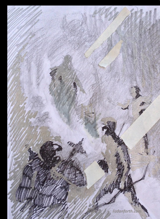
On that topic: we’ve been making good progress on the revisions. I’ve even come up for air long enough to start doodling the early stages of prep to paint the cover. If you’re not an artist yourself, this will probably look like a scribble (at best). Doing even a rough value-sketch like this has proven to be one of the most important things for me in the preparatory stages of a painting. I’ve done several and, so far, this is the one I’m most inclined to pursue further. (The shaded version you saw on the Free RPG Day booklet was Steve Crompton’s idea, because we needed SOMEthing on the booklet. I knew what I had in mind was different all along.)
Consider this a teaser of things yet to come.
HOW TO BID HERE
If you want to bid on either one of the finished paintings — Elven Lords or Two Seconds Later — send me a private email at etdanforth @ gmail.com (no spaces) with your best offer. I am going to end the auction Sunday night, midnight, MST, without further extensions.
In the Comments section to this post, I will let people know if there have been counteroffers.
You can, of course, still decide to pass. No bunnies will die. Really.


Things I like about the cover concept (and I’m looking at both the image above and the one from the Free RPG day):
There’s a very elegant S-curve that flows throughout the composition from (starting in the lower rh corner) the dwarf’s hammer handle up through the archer’s pose to the wizard’s gestures, then to the ??? flowing up into the scene.
There’s just a hint of a troll in the background–I read this as if the adventuring party is reacting to the ???, while a bigger, badder threat looms in the background that none of them is reacting to (yet.) Which is quite clever (hope it’s enough “Troll” for the product, cuz I likes it.)
The characters are very well thought-out suggesting backstory thru visuals.
The ??? rising up out of the floor of the cavern is way-cool, and she oozes menace.
What I wish was stronger:
A more urgent and forceful sense of action and tension throughout the scene as conveyed by the characters and their poses.
For example, the caster’s clothes are billowing, denoting action, but his hands could be posed in a more forceful gesture than the one in the sketch. Also, it would help if he was leaning *into* the action rather than away from it.
The archer is probably the most dynamic of the three–but even there it would be cool to see her right arm up, elbow in the air, caught in the midst of drawing an arrow from her quiver. (That gesture would play perfectly into the aforementioned s-curve.)
The dwarf…he has a lot of character, and while I’m glad that he doesn’t have the stereotypical mega-blade axe…it’s just not shouting “ACTION!” to me. More of a forward crouch/half turning posture as reacts to what’s going on? And, for the most prominent face on the cover, the expression is very, very neutral. Maybe something more expressive (a scowl, a war-cry, a “what the hell is it now, firk-ding-blast it?!!)
Thank you for the thoughtful response to the sketch, Steve. I must clarify/disagree on some points, but I hope not in an argumentative aspect.
I prefer to paint that moment of anticipation before action really explodes, even in an action picture. Consider the difference between the all-out action of the 7e cover of T&T and the “it’s started but about to get much, much worse” of 5e. It’s one of the things about the 7e cover I don’t really care for … in media res is great for writing, but visually, I prefer the dynamic tension of unrealized action fraught with anticipation.
That S-curve you refer to is interesting to me… I see your point, but my eye makes a Q-shape (my fall-back from years of looking at Art Nouveau compositions). There is also a hard-edged left-facing carat (think CAP-comma on your keyboard) built entirely of light flow, which I intend to augment. Those are the elements of action as much as whether the characters are jumping up and down like monkeys!
The caster is leaning away because he’d probably like to be RUNNING away! At the very least, he is rocked back on his heels. His spell is not a TTYF (which would be too repetitive to previous covers) but presumably some kind of protective shield or warding. (I haven’t decided exactly how to handle it yet.) He’s the only one who has gotten a good look at things. And that’s why the dwarf’s face is so bland… he knows something is up, but has absolutely no idea what, yet. If you look closely at the sketch (what you can see of it) his lip is curled and he’s got a ferocious scowl starting up, but his “action” is at least a full second into the future. More to the point — while being full-face-on, he is probably going to be the LEAST eye-catching face in the painting, something you can tell by the extent to which he falls in darkness.
As for the archer, I refer you to http://www.lizdanforth.com/2013/01/the-archer-deluxe-tt/ She is the anchor of this painting, the main character facing the threat. Both dwarf and mage will fall back with atmospheric perspective.
And the “bigger badder threat” overshadowing the ??? … tsk tsk. No comment there, except to say “don’t make more assumptions than the data can justify.” LOL
Liz, thank you very much for your reply. As a fellow artist I love to get a glimpse into the process and the thoughts behind the art we see.
Oh Liz, trying to class up the joint and taking the high road with your art?
It’ll all end in tears, tears I say…
Neither more nor less than in years gone by! The difference is that now I have the context to try and explain what I’m doing!
As for tears… my brushes are cleaned with tears and blood. Trust me on that! (You can decide if they are mine or that of others LOL).
I’m glad you enjoyed that, David. I have definite ideas of how the cover will look, in the end. The dT&T project is crowdsourced, fan-driven, and collaborative in execution, but this painting is not. (On matters like this, I barely cooperate with my titular art director, Steve Crompton!).
I truly have no objection to a critique of the work and “It doesn’t have enough action” is a complaint I’ve heard out before now. I have enough years and experience to say “No, sorry, too bad; this is the way it’s going to be.” I’d also suggest, in that respect, people should go look at book covers of action adventure and sf/f books presently on the market. Even the decades-old Conan covers by Frazetta often have a dynamic stillness (Deathdealer, anyone??) more often than the red cloak ape. There are good artistic reasons for that.
Showing “work in progress” is not something I do readily. It’s much easier to have this kind of discussion after the fact, when everyone can see the end result.